In this section
Graphing Requirements
Guidelines for formulating graphs
Graph title
Each graph produced by the learner must have an appropriate title. This must be concise and describe exactly what the graph depicts. For example, where the practical has involved the study of effect of reagent concentration on iodine clock reaction then a suitable title could be ‘1/t vs concentration for iodine clock reaction’. A title of ‘1/t vs concentration’ would not be sufficient
Graph axes
In plotting graphs it is necessary to consider what quantities to plot along which axis and the scales to be used.
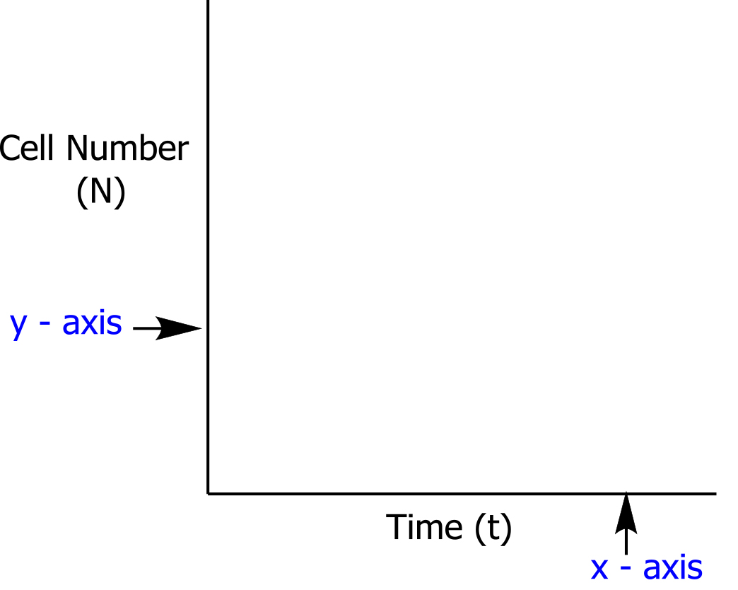
Convention is that the independent variable (ie the quantity whose value is selected by the experimenter) is plotted along the horizontal axis and the dependent variable (ie the quantity whose value is determined as a consequence of the choice made by the experimenter of the independent variable) is plotted along the vertical axis. For example, in an experiment to determine the growth rate of a bacterium, the experimenter might choose to vary the time at which they take measurements and record the resulting cell numbers. The time (t) is then the independent variable and the cell number (N) is the dependent variable. If a graph is to be plotted to show the relationship between t and N, then the graph axis would be as shown below:
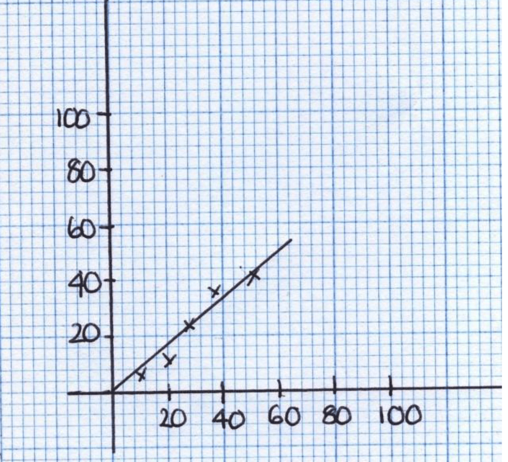
Each of the axes will have a scale. Learners must choose a scale that allows the points to be plotted to occupy more than 50% of the range of the axis used for the graph. It is poor practice to plot a graph with scales from 0 to 100 if all of the data points have values between 0 and 50.
The graph below depicts some badly chosen scales:
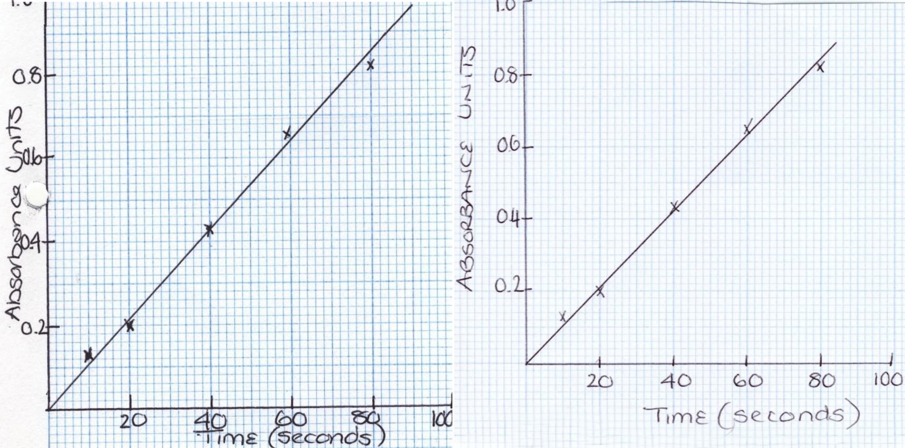
It is essential that the graphs prepared by learners are clear and easy to read. The graph should also be capable of representing the accuracy that is aimed for in the analysis. The larger the scale used the more accurate the graph will be, but it is not normally a good idea to draw the axes along the edges of the squared part of the sheet, as this may mean squeezing the labels and titles into a small space (see examples below).
However, learners must also be made aware that whilst it is not normally a good idea to draw the axes along the edges of the squared part of the sheet, they need to carefully consider the scale for their axes as they should not be using a more compact scale for their axes than they otherwise would have done.
Positioning the graph on the graph paper
The graph above on the left has its axis drawn along the edges of the squared part of the graph paper. This has meant that the labels and title must be squeezed into small spaces. The graph above on the right is better example of how to position a graph on the graph paper.
Choosing appropriate scales
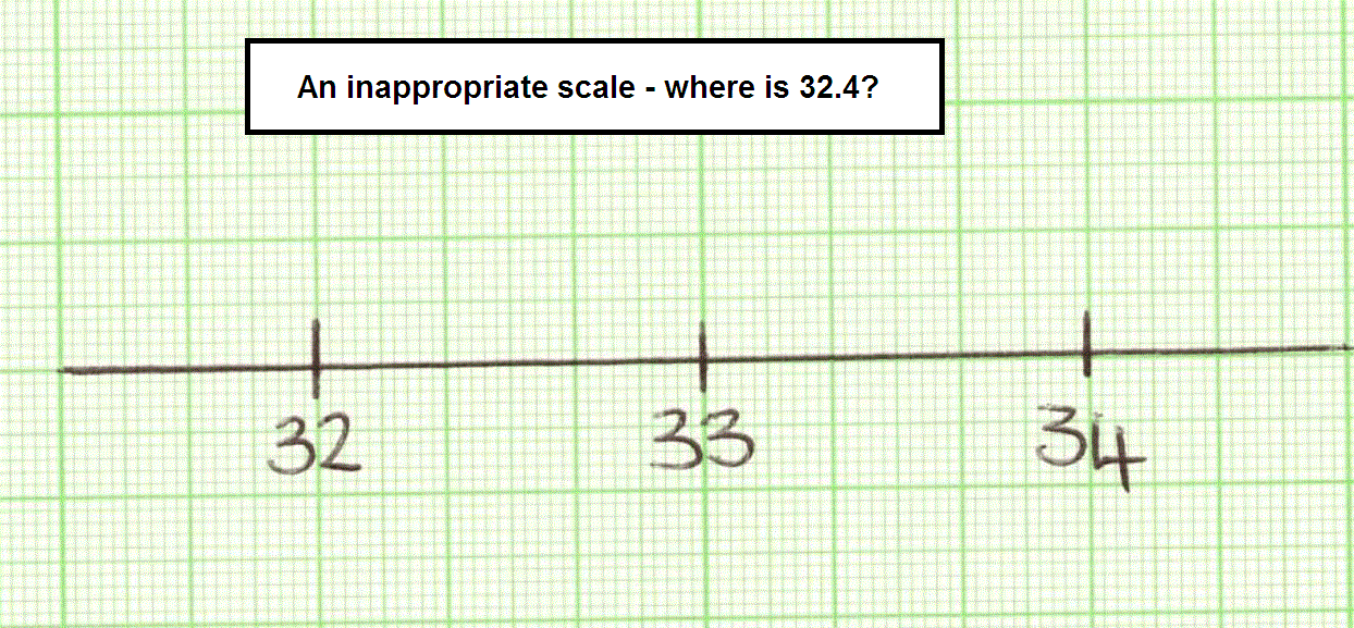
Learners should not use a scale which makes it difficult to read unknowns from interpolation. An example of a poor scale choice is given below:
The relationship between the scales on the x and y axes also affects the clarity of a graph. The graph shown below on the left can be made clearer by adjusting the scales; the result is shown on the right.
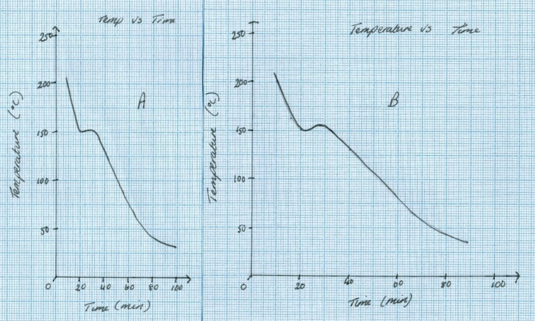
The scale of the x-axis on the graph above on the left is too small. The scale on the graph above on the right is better.
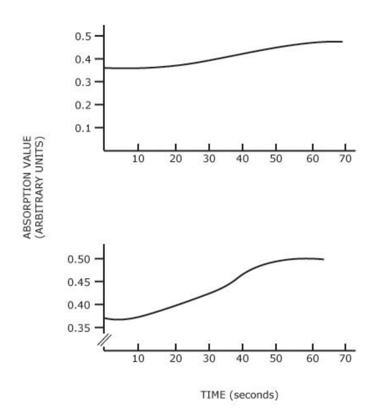
On some occasions it would be more suitable for learners to label axes that start at a value other than zero. The example below shows just such an occasion, where this aids the clarity of the graph. The data on the upper graph can be plotted more clearly when the y-axis starts at a value other than zero.
Axes labels
The learner should clearly label each axis of the graph. The label should include a description of the parameter, its symbol (if appropriate) and units.
Line of best fit graphs
In some experiments learners may be required to produce a line of best fit graph.
Learners should be supported in developing competence in the graphical presentation of scientific data. To achieve this, learners should be encouraged to undertake a methodical approach when trying to establish the general relationship that exists within their data. They should be given advice on good reasons for ignoring points on a graph and on deciding whether a graph should pass through the origin. Learners must be made aware that (0, 0) is not a genuine result in every relationship and therefore all graphs do not automatically pass through the origin.
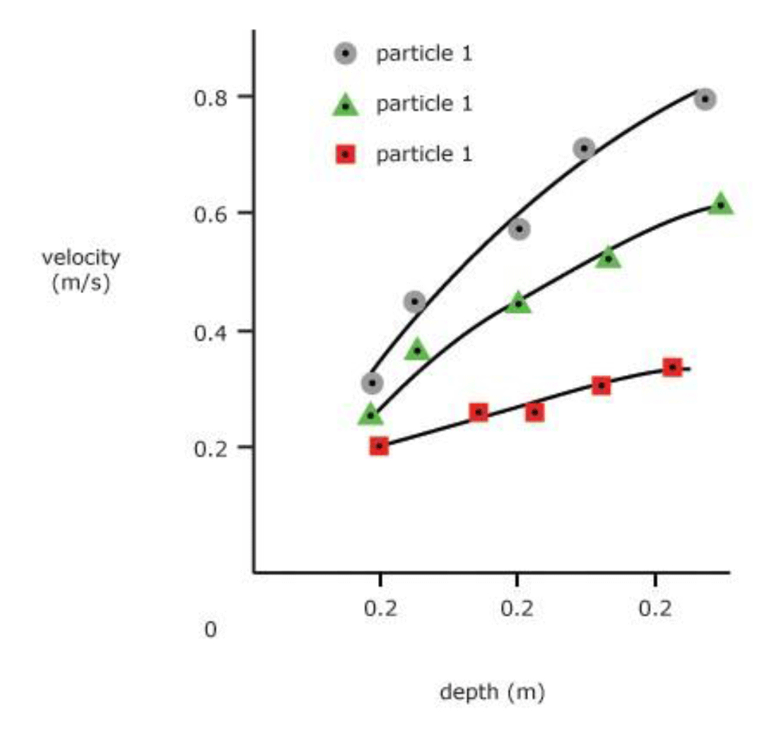
Learners should be encouraged to adequately differentiate between different data sets presented on the one graph. This may be achieved by using different symbols to plot the different sets of data points or by using different types of lines (dashed, dotted). An example is provided below:
Type of graph
The type of graph should be appropriate to the data set and intended purpose. If the x- axis data is continuous then a line graph or scatter graph should be used. A scatter graph should be used where the purpose of the graph is to demonstrate a continuous relationship. A line graph should be used where the purpose is to show changes between readings. A bar graph or histogram should be used if the purpose is to display categories.
It is unlikely that a pie chart would be acceptable for any experiment.
